Sunday, 7 April 2013

Oakland Art Murmur


I attended my first Oakland art murmer last night since moving to the area. It was quite the occasion, with Telegraph Avenue between 19th and 27th street blocked off for a variety of street stalls, music, food carts and other entertainment. There were also numerous galleries and studio spaces around downtown Oakland open until 9pm, and many of the bars and restaurants had live music filtering out the doors. I arrived early, when the streets were still being blocked off and many vendors were only just arriving. This meant I got to take a leisurely wander and get a look ahead of the crowds, I even got a tarot card reading and my portrait drawn for free, before queues started forming.
The street fair boasted mainly pretty objects for sale, handmade jewellery, cacti in an assortment of glass jars, leather purses and hand printed tshirts. I was glad to have only brought the bare minimum of cash with me, to resist spending my weeks wages on all the beautiful things on sale. Much of the art here was street art, silkscreened posters of Obama smoking a joint, posters from the naked bunny project, a guy with his own steam punk customized bicycle with a pull along mobile gallery adorned with matching paintings. 
As I got to the galleries in the surrounding area, the crowds had swelled and it became difficult to get into many of the venues. there was a good selection on show, with open studios FM displaying by far my favorite art of the evening. Mostly ceramic artists, with one photographer, one printmaker and a painter thrown in for good measure, the stand out was a selection of prints small delicate black and white etchings with accompanying typescripts. In the push of the crowd I didn't manage to get the artists name, but his stand was surrounded by the haunting marionettes of Peter St. Lawrence, and despite scrutinizing their website I can't seem to track him down.
A couple of doors down was Manna Gallery with an exhibition by Jhina Alvarado-Morse, a series of beige photorealistic paintings and some large abstracts by Linn Thygeson. Photo gallery had a show of vintage esoterica a nice collection of prints from the collection of Louis Klaitman. There were some real  classics in there from the likes of Henri Cartier-Bresson, Annie Liebovitz, Ralph Eugene Meatyard and William Wegman. In Mercury 20 was the very amusing show "Pet Peeves" by Julie Alvarado and Charlie Milgrim. A series of dog portraits on one wall faced down a very odd collection of green bowling balls against the other wall- the "pet peas" of Milgrim which were dressed up in leads and collars, put in cages and fish tanks in a mockery of the containment and control of animals as pets. While the humor of these works quickly wore off, Dave Meekers exhibition "Lucky" had a little more depths. These sculptures "conceptualize the luck that surrounds us. The artist imagines this intangible with an inviting sense of humor. Luck is aligned with chaos and chance. It comes in many shades of good or bad, big or small, and may have very little to do with our own desires, wills, or intentions. These works are lyrical, associative, and built on the premise that every day we are presented with lucky moments of one kind or another, and that we may choose how to interpret, accept or reject them". (www.davemeekerart.com)
I will definitely be going again next month, and saving up in order to indulge in the assortment of beautiful things on sale. I also hope to venture further downtown, towards Jack London square and pop into some of the other galleries that I didn't have a chance to explore last night. As well as all the art on show (a lot of which is being sold at very reasonable and affordable prices) there is a delicious selection of food, wine tastings, live music, DJs and other arts and crafts to part you from your hard earned cash. 
I would advise starting early though- as the night descends into rather messy drunken revelry pretty quickly with queues to get into all the bars and the streets thronged with teenagers and drunks. 
The website for the whole event along with maps of participating galleries can be found here: http://oaklandartmurmur.org/


Tuesday, 2 April 2013

Without reality: There is no utopia

Without reality there is no utopia in the Yerba Buena Center for the Arts attempts to compile a collection of artworks that "focus on political systems, their temporal nature, and the fragility of democratice ideals".
The show features a varied range of meiums, artists and messages, tied together by a rather tenuous claim to the political. I found the scope to be too broad, encompasing too many voices and losing its stated purpose amidst the chatter of so many voices of protest, freedom and revolution.

The exhibition takes its premise from the philosophical conceptions of Jean Baudrillard and Andreas Huyssen.  According to Baudrillard, what has happened in postmodern culture is that our society has become so reliant on models and maps that we have lost all contact with the real world that preceded the map. Reality itself has begun merely to imitate the model, which now precedes and determines the real world: "The territory no longer precedes the map, nor does it survive it. It is nevertheless the map that precedes the territory—precession of simulacra—that engenders the territory. “It is no longer a question of imitation, nor duplication, nor even parody. It is a question of substituting the signs of the real for the real” he is suggesting we can no longer distinguish between nature and artifice.(Full text here) (artists are claiming to break through this barrier ??)
Huyssen is then brought in to conclude that since the real has been lost and supplanted by the simulacrum, utopia can no longer exist, since it is intricately related to the superation and improvement of reality.  The disappearance of the real thus results in the disappearance of the utopian. This is why, according the curators of the exhibition, it is "urgent and necessary to reset the real, to return to reality, or, at least, to its analysis, in order to attempt to apprehend a new utopian thought. the situation demands it". I find several problems with this statement, besides to over enthusiastic use of commas. Although not being all that well versed in Huyssen's theories I am a little shy to criticize, it does seem to be rather a leap to presume that utopia cannot exist without reality- for how then is it supposed to become a reality? Surely the dreamscape of the simulacra make a ripe ground for the introduction of a utopia? Or must utopia always be on the outside, a ghost dogging the edges of the real?
Either way, the exhibition sets up a nice philosophical premise as its introduction that gives the viewer a lot to chew over before the any of the art itself is introduced. Then we come to the problem of how to connect this grandiose concept to tangible works of art. Here the curators insert another conceptual step: they divide the exhibition (and the physical space) into two asymmetric sections. The first is titled: "Description of the Lie", as a prologue to the systems of production of the simulacra of the real. The second section is titled: "Collapses", which is further divided into four collapses; the collapse of communism, the collapse of capitalism, that of democracy and that of the geo-political. This further categorization is defended by another quote from Huyssen "Utopia never dies alone: it drags along its counter-utopia". Thus communism is suggested to have dragged along its counter utopia, capitalism, which in turn involves a geo-political implosion.

With all this complicated conceptual setting up before any artwork is even introduced, I was starting to feel the need for a map to trace the development of these ideas. And as you turn from the descriptive written introduction on the wall, there before you is indeed a map. Perestroika Timeline is a long black banner interrupted by white text and images which cut into the smooth line that circumscribes the gallery walls. The text refers to various incidents in the collapse of communism: the fall of the Berlin wall, the end of the soviet union, the reunification of Germany and the dissolution of the Warsaw pact. At the end of the timeline there is a split, between a utopian idealistic possible outcome and the negative damaging reality. Created by Chto Delat? http://www.chtodelat.org/ a loose collective of Russian poets, artists and philosophers, singers, designers and critics, reality is presented as a chronological sequence of events that leads towards a political collapse, and is presented as preventing and obstructing reality. So far, so political.

The rest of the exhibition follows this same vein, works that are engaging with the negative outcomes of specific political regimes, while not actually positing any alternative, escape or even addressing any more pressing questions. Many of the pieced felt like filler, chosen for their mildly anti-capitalist or pro-minority focus, such as Carlos Motta's Ideological Graffiti, which archives the opinions of citizens of 12 Latin American countries focusing on the perception of interventionist policies of the USA.

Another timeline, which was a little more successful as a work of art, was Daniel Garcia Andujar's Postcapital 1989-2001 Which takes imagery from the media and ideological stereotypes and generates a bizzare melding of two extraodinary resonant moments in recent history: the collapse of the Berlin wall the the destruction of the twin towers in 9/11. A digital archive gathered from images on the internet, the piece covers the majority of an entire wall, the shiny colourful images attractive like familiar adverts. It's only on closer inspection that the message is revealed: Che Guevara in an ad for sports shoes, an ad for a men's magazine with an image of the Kennedy assassination, in which Jackie is the one shot and a tagline of "if men are your target make sure you don't miss them".

As described on the project website:
       "Here, Andújar views the developments subsequent to the “fall of the Wall” not as aspects of postcommunism but rather of postcapitalism. Emerging here is the question as to what extent capitalist societies have changed in absence of their erstwhile counterparts and which new walls have been erected through the global politics following events of 1989 and 2001. The triumphal course of capitalism and of the Western democracies has by no means proved to guarantee peace, security, and stability, as the conflicts in former Yugoslavia, the war in Iraq, or, even more recently, the slumps in the U.S. financial markets have demonstrated. “Postcapital” is an attempt at reading the complex and divergent realities of the twenty-first century by virtue of their forms of representation: the review of an age whose prelude has been pinpointed by Andújar as localized between 1989 and 2001". 


Ignasi Aballi"s Listados (World Map) 2010 takes a less pictorial approach. In a series of frames, the artist lists the names of every country to appear in news headlines in every section of every edition of the spanish daily, El Pais over the course of one year. The result is a printed version of a tag or word cloud, with the size of the font and recurrance of certain names indicating the bias and focus of news media. It is a measurement of the appearance and disappearance of collective or individual presence of countries and events that took place, based on the priorities of newspaper editors. By default this creates hierarchies of visibility of some events over others. Listed alphabetically I found myself wanting to know how the list would appear if ordered chronologically, or if compared to similar listings from other newspapers, both in the same country and in others. 

While Aballi's work raises a complex set of questions about the relationship between media and public interest, other works in the exhibition were more blatantly political, not always to positive effect. 

Oliver Ressler's work contained too much news and not enough art, and the predominance of charts, maps, timelines of political developments and ideologies became tiresome, such as Zeina Maasri's political posters depicting various signs of conflict from Lebanon's Civil War. While visually pleasing, the posters have very little insight besides revealing bias and design strategies for propaganda.  This is symptomatic of the general failing of the exhibition as a whole, the leap between the first and second proposal is not made, the response of the art to the collapse of utopia is a loose collection of political imagery with no message. 

This for me, sums up a major problem with group exhibitions, while the theoretical premise contains an interesting and powerful idea, the actual art fails to measure up, perhaps due to it being a group show, I felt that some of the works were being made to ascribe to a preset concept  in which they did not fit comfortably. 


Thursday, 21 February 2013

Emin on Art and Love and Art

“I love art,” Emin went on. “And art loves me more than any man has ever loved me. Art has never let me down. When I’ve been my lowest of my low, art has always come and picked me up. I can’t say that about the men I’ve had relationships with. It’s about forever and ever. The last thing I do before I die will be art, definitely. Whereas people come and people go. I wish I could have a lover like art, that loved me as passionately as art loves me, or who I could give as much back to.” Read more: The New Yorker


Wednesday, 20 February 2013

The Fantastic Planet

I met a rather interested character in a hostel in San Francisco recently. He was visiting the city for a few days from Stanford and started talking to me in the computer room, looking for some human conversation I think. A Phd student of applied physics, he also taught a music technology class and showed me his website for generating music through computer programming. I didn't understand it much, but he asked me about my area of study and had a surprising interest in Land Art and Andy Goldsworthy in particular. He also told me about this crazy little French animated movie, The Fantastic Planet and insisted we watch it together. Unfortunately the movie room was occupied, and we ended up going out to a bar instead, but a few weeks later I finally got around to watching it by myself, and now I'm sorry I didn't get the chance to see it with him, I would love to know what he had to say about it.

A bizarre, surrealist animated film, it was made in 1973 and directed by Rene Laloux, with animation by the writer and artist Roland Topor. The graphics are more akin to the painting than the animation tradition, with slow movement and sketchy lines, all the colours are subdues browns and the whole landscape is reminiscent of a surrealist Dali dreamscape. The imagery is very dream like, with large moving plants that devour each other and populated with a variety of threatening animals and anamorphic forms.
The story centers around a distopian future, reminiscent of planet of the apes, where human creatures called Oms are the playthings of the large Draags, blue creatures who are a hundred times the size and are an advanced species of meditating aliens.  They keep the Oms as pets, and regularly carry out mass exterminations of the wild Oms living in the forests. The plot follows the life of one Om, Terr, adopted when orphaned by a young female Draag named Tiwa. Tiwa's father is one of the ruling elite, and through Tiwa's daily lessons, Terr learns about the culture and history of the Draag planet. When he eventually escapes to join the wild Oms, he takes this knowledge with him to help build space ships for the Oms. With these ships, Terr travels to the Fantastic Planet, where he destroys the huge grey statues he finds there that allow the Draags to reproduce, thus threatening the whole race and simultaneously preventing a mass extermination of his own species.
The film was produced between France and Czechoslovakia and is an obvious allegory for the Soviet Occupation of Czechoslovakia. With the oppressed rising up to threaten the rule of their oppressors, it has resonances for any master/slave society, and can be read as an allegory for many different historical and political regimes as well as an influence on many more recent science fiction universes, from the Empire and Rebels in Star Wars, to the Naa'vi and soldiers in Avatar.
What is unusual in this portrayal of rulers and ruled, is the sympathetic portrayal of the Draags, particularly Tiwa, Terr's owner. In the beginning of the film we see her play with him like a pet, and we laugh at his antics along with her. Innocent of any wrongdoing, it is difficult to blame her for her treatment of him, as she does appear to be genuinely fond of him. The beginning of the film focuses on the civilization of the Draags, and we view the story from their perspective, it is only when Terr gains an education and becomes self-aware that the point of view shifts and we begin to sympathize with him.  When he escapes to join a colony of Oms in the wild, Tiwa disappears from the story, and we never learn her reaction or opinions to the following events. I found her to be a more sympathetic character than Terr, who plays the role of savior, uniting the warring Om clans to bring them salvation. A rather boring and predicable theme.
Strangely enough, the random scenes of large threatening plant life forms are more terrifying than the scenes of mass extermination of the Oms, possibly because the Oms are never given any personality or likeable qualities. The haunting atmosphere of this world is made all the more by the score by Alain Goraguer. It's experimentally trippy psychedelic sound fits the strange quirky animation and the weird slow pace of the narrative perfectly. The music and animation are the most fascinating parts of this film. I'm not a huge fan of science fiction other-worlds, and the story left me a little cold, particularly the abrupt ending, where the two warring species suddenly are able to live in perfect harmony with no hangover from their previous hierarchical society. I enjoyed it best when it abandoned all plot and focused instead on lengthy close ups of the beautiful painterly faces of the Oms, and the extended scenes of the planets flora and fauna.


Monday, 4 February 2013

Contemporary Korean Art


While contemporary Chinese art has never held much appeal for me; too overhyped and market driven, recently there seems to be an emergence of Korean artists in the west. My attention was first grabbed when in a museum bookshop I came across a beautiful edition of Korean Eye: contemporary Korean Art following the exhibition Korean Eye: Moon Generation,  the first international exhibition of Korean Contemporary art. It features sixty of Korea’s most renowned artists. There were some delightful surprises, fresh innovative stuff that easily challenges the most recent work coming out of America or Britain at the moment. There did seem to be a recurring theme, of bodies and identity, whether due to the bias of the curators or the artists, I’m not certain.

Here are some of my favourites:

Kim Joon
Joon’s work depicts large group portraits of anonymous bodies uniquely tattooed with a variety of patterns and colours.  He uses 3-D animation software to construct the body or bodies he wants, grafting on the type of skin he desires - animal skin, artificial skin, or human skin, even the skin of a leather bag or skin of a shoe. He uses this surface skin and grafts it onto the 3 dimensional image he created. This computer program is called 3-D Studio Max. It is the program used to create animated films. Some of his works include tattoos of logos, a reflection of the inscription of universal brands in our daily lives, perhaps even a wry comment on the trend for tattoos of brand names. The artist sees tattoos as a form of collective identity: “In history, anthropologists will tell you that tattoos were used for different kinds of purposes. Sometimes they were used to define boundaries, or to have your own social groups. Then at other times it was to punish somebody in a negative sense, to reject you. There is a notion of acceptance and rejection- a sense of belongingness and non-belongingness. The tattoo or tattooing doesn’t have just one singular meaning, but has multiple meanings, and conflicting meanings”.


Bae Joonsung
In his series ‘The Costume of the Painter’, he paints onto transparent acrylic films. Using recognizable old master paintings, he inserts young Asian nudes that are only revealed as the viewer walks by as a sort of hologram. The use of photography to update and invade traditional paintings plays on the relationship between the two media, and suggests a way of harmonizing the two, rather than opposing them. The viewer interaction in order to reveal the female nudes also introduces an element of play, creating a sort of peep-show effect. 


Lee Rim
‘The Mess of Emotions’ are large oil paintings originate in artistic performances, drawn from photographs of the artist or a model covered in black and white paint. 

"Our relationships are not decided alone.
Through various experiences and
conversations, thoughts are shared,
learning our differences and similarities.
This is the moment when spirits
combine. This feeling is unique in
forming relationships. As such, based on
the feelings of people, I first perform the
nervousness that only I may feel and
then transfer the image of that feeling
onto a flat surface. Even though we live
in different environments, at a certain
point in time we feel the same when we
look at an object. When I am having a
conversation with my family and friends,
I feel that we are of the same mind.
I believe that one admits differences
and similarities of each creature through
interacting with each other. Based on
a perception of this commonality, I try
to put my incidental excitement into
a two-dimensional surface of colours
presenting you with another imaginative,
phantasmagorical world.”
-artist’s statement.


Here are a few more not included in the exhibition who still deserve a mention:

Yeondoo Yung

In the Wonderland series, the artist takes children’s drawings and recreates the scene which he then photographs. Here is the making of, as related on his website: Jung’s new series of photos, “Wonderland” (2004), presents costumed ado­les­cents posing in sets based as closely as possible on children’s drawings. He collaborates with many peo­ple to bring to life the boundless imagination in the drawings. For four months, Jung oversaw art classes in four kinder­gartens in Seoul and collected 1,200 drawings by children between the ages of five and seven. After pouring through them, he carefully selected 17 drawings and interpreted their meanings. Then he recruited 60 high school students by pass­ing out hand­bills at their schools in which he invited them to act out the scenarios in the children’s drawings. In order to recreate faithfully drawing details such as dresses with uneven sleeves or buttons of different sizes, he convinced five fashion designers to custom make the clothing for the photo shoot. He also made props unlike any scale found in real­ity but similar to those in the drawings.
“Wonderland” changes fan­tasy into photographic reality without the aid of computer-generated graphics. The works, entirely made by hand, are a tremen­dous group effort similar to a stage production that captures the sudden changes in the actors’ forms, in the midst of people going about their lives against the back­drop of the city.


Sora Kim
Sora Kim’s ‘Abstract Walking’, deals with a theme very close to my heart. A sound installation, it presented a vast spatial and temporal territory that encompassed diverse stories and interpretations, and invited viewers to walk in this abstract territory. Produced for the Artsonje Center in March 2012, Kim collaborated with different artists and participants throughout different stages. First she collected stories of journeys from the participants. Then nine writers turned the stories into scripts that included their personal reflections and interjections. Next, eight musicians created accompanying scores, which were edited into one sound piece by music director Younggyu Jang. In the gallery the finished piece is played, “creating an abstract territory where the detritus of the collected spaces and time and the interpretations of various artists are scattered throughout; and suggests ways to experience art in an emancipated way, walking in the artist’s abstract territory”. A video work also accompanied the exhibiton. This creation of territories and emphasis on walking reminds me of the artist Francis Alÿs, who uses similar practices to create his artwork, as in the piece ‘The Green Line’,  in which he retraced the border between Israel and Palestine carrying a leaking can of green paint, telling the story of a fraught political history through the medium of walking.  Less politically charged than Alÿs perhaps, but Kim’s conceptual practice uses art as a means of communication, creating a space for non-hierarchical exchange and using elements from everyday life to produce unexpected dialogues.


Wednesday, 5 September 2012

For Inkeater (August 2012)

No, not ill-intent,
but ignorance.
To a fly's eyes
the world is magnified.
It's mass inflates;
When crushed,
then by his own weight.

Monday, 16 April 2012

Humour

The use of humour in art has traditionally been consigned to the position of second class citizen, deemed the lesser sillier cousin of high art and used primarily for as a tool for political and social commentary with little merit in its own right. William Hogarth was perhaps the first artist to be taken seriously as an artist and as a humourist. This is perhaps to do with the moral message of his painting, that was in keeping with the grand historical portraiture of the British Academy of the time.

Historically, the medium of painting doesn't lend itself well to humour. It is too reliant on narrative and realism descending into the realm of caricature or cartoon when it attempts to be cheerful. With the expansion of media in contemporary art, humour has found a new place, no longer reliant of funny depictions of people or scenarios, artists are employing ever ingenious means to elicit both a lighthearted chuckle and a deeper philosophical reflections from viewers, giving humour a new found position in contemporary art.


The power of humor in art is when meaning is layered and context destabilizes its superficial funniness to reveal something deeper and more meaningful. Humor can be a useful tool in art: ‘it can destabilize a situation and in a split second, draw the viewer in or allow something else out” – (Adam McEwen British artist based in New York).

Laughter can create a connection between the viewer and the work or the artist, allowing the work to be subversive. Humor can operate as a sign of humanity, in the face of overwhelming or dark situations.
Narrative plays a big role in the use of humor in art. Jokes need a set up, a funny situation or a narrative juxtaposition in order to generate laughs. This leads to a lot of artists who use humor opting for video work, such as Allora and Calzadilla's Returning a Sound (2004-05).


Homar, an activist, rides around Vieques on a moped that Allora & Calzadilla reengineered by  a trumpet to the exhaust system. During the ride, every thrust of the throttle or shift in speed alters the instrument's pitch. Allora & Calzadilla have edited out other ambient noise, leaving only the alternately sputtering vibrato and clear, pure sound of the trumpet as a jazzlike soundtrack, a call to action, or perhaps an anthem, as the artists discuss in the interview that follows. Their works counterpose militarism and war with adroit manipulations of sound, music, and spoken word.
 Strategically seeking out the sounds of combat as their sonic media, Allora & Calzadilla endeavor to reissue sounds whose meanings have grown far too familiar in an effort to restructure, at the source, those corporeal conformities, always marked in and on the body already, through which violent and potentially devastating action first becomes possible.


Created in 2008 and presented at the Zach Feurer Gallery, New York video artist Tamy Ben-Tor tackles issues pertaining to social customs and gender roles in her video titled Gewald. As evident of her work, Ben-Tor uses child-like story scenarios and songs to awaken social perceptions through her witty portrayals of everyday-life. At first impression, her work seems silly and even irrelevant, but as the video progresses, one may begin to understand the serious subject she addresses and the message conveyed.

At first in Gewald, Ben-Tor dressed in brightly colored folk attire sings how we must be aware of the household “man covered in mud who knows no piece” and the “woman with a cold womb like a frog.” As the video progresses, she advises children to “carve into their hearts” and “turn their eyes away” from the behavioral roles portrayed by these individuals she sings about.

Installations, such as Michael Farrell, or the wall drawings of Dan Periovschi that are also a performance, are mediums more suited to constructing a background or context for the humor to emerge. 

Dan Perjovschi is an artist, writer and cartoonist born in 1961 in Sibiu, Romania. Perjovschi has over the past decade created drawings in museum spaces, most recently in the Museum of Modern Art in New York City in which he created the drawing during business hours for patrons to see. The drawings present a political commentary in response to current events. Another exhibition of Perjovschi's within a Portuguese bank consists of several comic strip style drawings which address more European issues such as Romania's acceptance to the EU and abortion legalization in Portugal.


While painting or photography can also contain narrative, it needs to deliver its message instantaneously, within one frame restricting the ability to build up layers of meaning or context. Such works tend to go straight for the punch line, delivering their humor in a short sharp kick, such as the studies of perspective by Ai Weiwei.
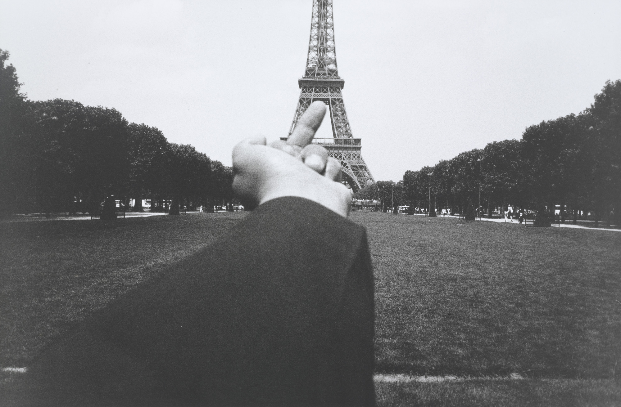

Humor can also be used to mask the more serious issues, or as a release for dealing with repressed emotions. As Brooklyn artist Chris Doyle says, “If you cant find tremendous humor in the everyday, the sadness becomes overwhelming”. The problem with funny art is that is can often be regarded with suspicion, discouraging a more thoughtful engagement by a viewer. If it is good art it should prompt a second glance, one that looks past the joke to the message being delivered. That is perhaps what separates art that is merely cartoonish, aiming only to inspire a giggle, from art that uses humor as vehicle to discuss a deeper message- Humor that operates as a means to confront other issues rather than an end in itself.


Several themes begin to emerge in the work of artists employing humour.
Political satire has perhaps the most developed historical tradition reaching back before the days of Hogarth. Today artists employ a wider range of materials and references to pack a political punch. 


Fergus O'Neill, a Dublin based graphic designer penned the slogan, "Keep Going Sure It's Grand" which he then turned into posters. It's a play on the British, "Keep Calm and Carry On" posters from World War II which were intended to keep the British people calm while they faced potential invasion.
SAVE IRELAND! That’s the objective of graphic designer Fergus O’Neill’s ‘Keep Going Sure It’s Grand’ project. By producing an original edition of 42 billion screen prints, O’Neill is pledging one euro from every sale to the state thus halving our banking crisis debt. He says of the project: “the bid to sell 42 billion of these posters may seem absurd but it can be deemed no more absurd than the outrageous practices and policies that landed us here. There is little we can do except be ourselves and get on with it.” A range of 'modern Irish' products have emerged from the process as O'Neill believes Irish design is more than the twee and more than the serious, it can also be humorous but well designed. If he succeeds, his endeavours will halve the debt our fair country is currently drowning in. He also sells other merchandise with brilliantly funny Irish slogans like, "Feck It Sure, It's Grand" and "Grand Lovely - Bollox Shite" and "Fine Words Butter No Parsnips".


Erwin Wurms Instructions on how to be politically Incorrect,  explores boundaries of privacy and social taboos, the humour is also an astute comment on the atmoshphere of paranoia and invasion of civil rights that is prevalent in the current climate of suicide bombings and terrorist attacks.


In her subversive Sexy Semite (2000–2002), Emily Jacir peppered the Village Voice with personal ads for Palestinians looking to settle down in Israel. One asks "Do you love milk & honey? I’m ready to start a big family in Israel. Still have house keys." Another, more pointed, reads: "You stole the land. May as well take the women! Redhead Palestinian ready to be colonized by your army." The ads slyly suggest a way around an irreconcilable issue in the Middle East peace process: by marrying Israelis, Palestinians can gain citizenship and thus sidestep calls for the "right of return" (an unfulfilled provision of UN Resolution 194 that promises Palestinian refugees the chance to return home). But, given their placement in the love-wanted section instead of world news, the ads seem less about policy than the personal. Individual lives--people seeking love, a sense of home, the kind of daily routine you and I enjoy--are profoundly impacted by the occupation. And perhaps it’s through individual relationships that the conflict can ease. As one ad punned: "Palestinian Male working in a difficult occupation. I’m looking for a Jewish Beauty... Only you can help me find my way Home."

Gender/race stereotyping is another common theme, for example in the confrontational posters by Michael Ray Charles, which expose racial stereotyping by appropriating and exaggerating advertising imagery, and the crawl videos of William Pope L. while Canadian artists Shawna Dempsey and Lorri Millan create short videos satirizing lesbian and housewife stereotypes.

In Where’s Mickey? (2002), Destiny Deacon analyses issues of race, gender norms and stereotypes through the use of satire, humour, and images we recognise from childhood. Deacon presents us with a bright, colourful image of a "mouseketeer". The Mouseketeers were the youthful fan club of the Disney cartoon characters Mickey Mouse and Minnie Mouse. These happy, smiling white children were broadcast across America and around the world on the television show The Mickey Mouse Club. This program was broadcast internationally in the late 1950s, a period in history that particularly interests Deacon as it predates many changes to social, race and family relations. Importantly for Deacon the Mouseketeers presented an idealised, sanitised version of what American children should be like. This artwork reminds us of the historical omission of non-white people in the media. By presenting a black Mouseketeer, Deacon corrects this historical discrimination. Questioning identity, its construction and perceptions is integral to Deacon's work. Deacon creates a parody of a female Mouseketeer, (or is it Minnie Mouse herself?) by appropriating parts of the costume (such as the mouse ears hat, shoes and gloves), and by using other found items such as a 1950s style hat. In this photograph Deacon takes this sense of parody further by using a man as the model, further bending and subverting this cultural icon by disrupting our expectations. The image suggests the childish game of dress-ups, with a serious undertone. The bright, flat colours are rather gaudy and cartoonish. The rumpled curtain, shallow stage-like space, and exaggerated pose suggest the theatrical, with the performing figure looking like it is part of a travelling troupe or a vaudeville play. The disembodied leg which can just be seen coming from outside the frame in the bottom left corner further accentuates the feeling of theatricality and artifice.
(from MCA Education Destiny Deacon: Walk & don’t look blak Resource Kit) 


Humour is also used to expose cultural or national stereotypes.The Blue Noses Group Chechen Marilyn conflates an image of a female suicide bomber with the pose made famous by Marilyn Monroe in the Seven year Itch. John Carson’s A bottle of stout in every pub in Bundoran, explores the limits and excesses of Irelands drinking culture.“In ritualizing the drinking situation and pointing out the effect of too much alcohol and in depicting all the different types of pubs in Buncrana, my intention is to get people to focus in on and take a considered look at our traditional irish drinking habits. It is then up to the viewer of the work to wonder whether the drinking habit is a valuable cultural heritage, a desirable activity, a futile indulgence, a sinful business or a serious matter for concern.”Refused sponsorship by Guiness who felt it was not in keeping with their policy of moderation.

Christian Jankowski’s The Holy Artwork connect art and religion to the questionable medium of the entertainment industry. Paul Davis Prayer Antennae invites viewers to prostrate themselves in a ridiculous pose in order to insert their heads into a helmet offering communication with god.

In each of these works, the artist's are using humour to play with wider social and political issues, while the medium may have changed, they still bear a moral message rooting them in the tradition of political satire.

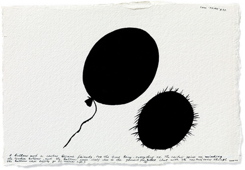
However there are artists who use humour on a much more personal level. Paul Davis and Nedko Solakov both use simplistic drawings styles to render comic imagery that confronts their personal fears, as in the collection of illustrations of Solakov’s 99 fears, and Davis’s diagrams of the futility of the daily grind in Wake Up.


Born in 1957 in Cherven Briag, Bulgaria Nedko Solakov lives and works in Sofia. Using a wide range of media and techniques, including painting and the appropriation of found objects, Solakov proposes fictional narratives that are at once humorous and dark.


Nedko Solakov, “From ‘Fears’ #37″, caption reads: A balloon and a Cactus became friends. For the time being – everything OK. The cactus’ pricks are minding the tender balloon, and the balloon keeps itself close to the ground for a better chat with the cactus (even though the balloon can easily go 56 meters high). 


Nedko Solakov, “From ‘Fears’ #40″, caption reads: “I feel very insecure stepping outside in the darkness”, says the man. “Shut the door! Your light is killing me!” the darkness replies by sending vibes to the man. “This is it – I got goose bumps,” the man mumbles and steps back into the house leaving the door open.